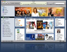
 In the auto industry, every so often, they come out with a new model of a car. Sure, cars change every year, but, every five years or so, they junk it out and come out with a whole new version. Software is the same way. There are lots of upgrades, but they do occasionally come out with brand new versions. And iTunes, which has been essentially unchanged since its creation, is "all new for 2007." And it's all bad.
I really liked iTunes 6.0: the luminescent buttons and scrollbars that glowed blue when you used them; the simple drop-down interface on the left side. It was a nice piece of software. ITunes 7.0: not so much. The blue buttons have been replaced by ugly gun-metal grey ones that do no sort of glowing; the buttons on the top and bottom aren't even the same color, kinda throwing the pleasing aesthetic of the whole thing out of whack. The menu bar on the left side is now broken up into different categories that drop down that don't even fit in the space allotted in the sidebar. When you plug in your iPod, instead of going to its library, it brings up the setup screen, which is great, if you want to change the settings on your iPod every time you plug it in, but mildly annoying if you just want to listen to some fucking music.
iTunes 7 does have some nice new features, however. I like how you can flip through all of the album covers and see what songs you have from those albums. And I like the counter that shows how many unlistened to podcasts and unfinished downloads you have. But, other than that, there is no improvement on the old iTunes; just more to hate.
Wednesday, September 13, 2006
iTunes 7.0 Is Pretty Much Shit
Posted by E at 1:11 am
Subscribe to:
Post Comments (Atom)

No comments:
Post a Comment